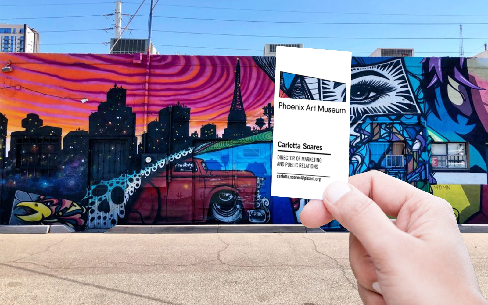
Phoenix Art Museum
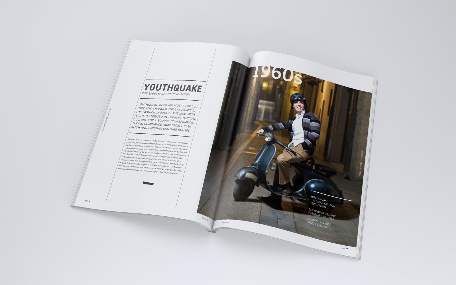
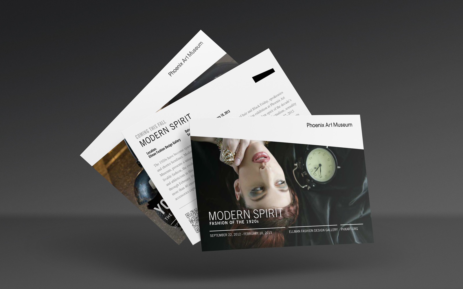
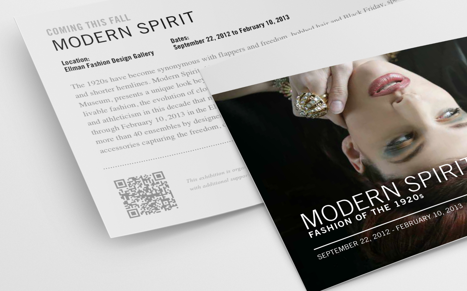
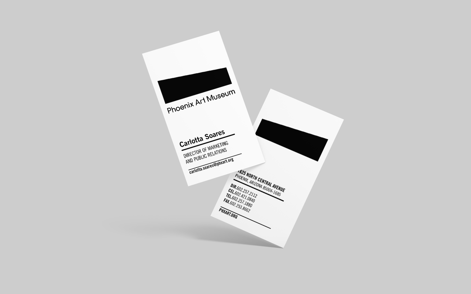
Phoenix Art Museum came to me with a problem: its brand and overall look were fragmented, with internal designers developing materials that were decidedly off-brand. The solution was to take a step back and peel back all the layers that had been added by various internal design teams to get back to the core of the museum’s brand. I started by using the museum’s iconic building shape to be the base of all collateral redesign. A shortened museum name “Phx Art” was used as an identifier for branding. Then, I developed a comprehensive brand guide, outlining specific design uses for collateral, newsletters, outdoor displays, exhibition take one cards, member magazines, and packaging. I also created a flexible templated system for the museum’s internal team’s work.
Brian Woodard / Design / Creative Direction
John Tomkiw / Copy / Strategy

